How important a part of the digital shelf is the hero image?
Quite simply, a good hero image impacts sales because it allows consumers to find products. A poorly designed hero image can have seriously negative effects. Once a good hero image is designed it can be used across all digital platforms to ensure consistency for the consumer, a key part of the omnichannel experience.
Standard packshot photography cannot be used for the digital shelf because the size of imagery and text is not appropriate for online visibility. Nor is the information on the packaging. That information needs to be prioritized and compartmentalized, and presented in a different manner. It’s crucial that the consumer can immediately find the information he or she is looking for. Shopper frustration must be avoided.

Online, ensure the brand name is clearly visible
The two key words here are size and declutter. The size of the brand name must be bigger than on physical packaging so that it is easily read online, and especially on mobile. Another way to increase visibility is to declutter, removing all text and extraneous information or design elements that could take away from the ease of reading the brand name. The visual of the packaging needs to be simplified to succeed online.
CPG image elements for the digital shelf
“Digital pack” is the name for the representation of the product pack itself, which exists within the “image tile”, typically the square space around the brand name, and “shelf item” which refers to all of the visual elements, which also include the format of the product, and the size or quantity.
Demarcating format and size with different visual elements like boxes adds to legibility and yields good results. Let’s look at those two factors a bit more closely because they play a role in the purchase decision.
Format or variant as part of the product image
This describes the type or the use of the product and clarifies its classification. For instance, it may describe a flavor, fragrance or taste. This is an important ingredient in the digital shelf imagery because it helps shoppers to distinguish one product from another. It needs to be clearly and quickly visible.
Retailers and brands need to be flexible and consider their particular situation to see how they can best benefit from their existing distribution network. Store-based fulfillment, dark stores, warehouse or micro-fulfillment options can all apply.
Size or quantity of online products in the digital shelf
This is another crucial piece of information consumers need to identify instantly. The amount or number of a product included in an item is usually written on the packaging but online it needs to stand out as an associated but separate element so that it’s clearly distinguishable.
Mobile-ready hero images

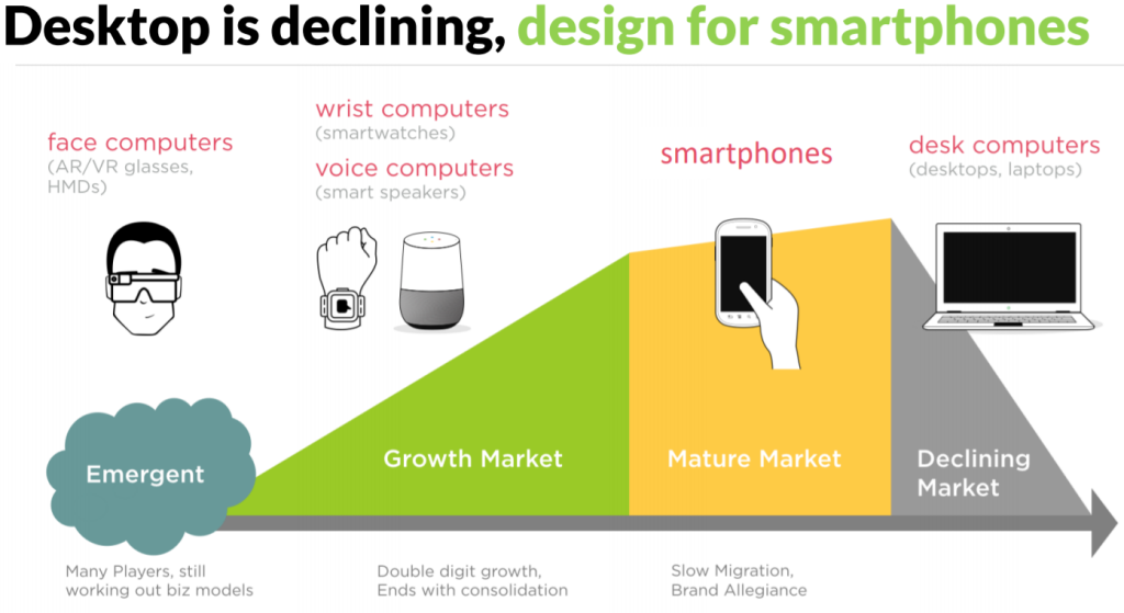
Mobile first is a term that’s becoming more relevant all the time. Desktop use is declining, as mobile, smart speakers, and connected watches are on the rise. This trend continues as more young people come of age. So mobile-first imagery is a priority and visual clarity testing is useful to ensure imagery is working as intended. Incidentally, accidental basket adds will be reduced by optimizing imagery in this way for the digital shelf.


