The “out of box” experience is a brand’s first impression. It is a critical touchpoint of the customer journey that often gets overlooked by organizations. This experience covers the unboxing, product setup and initial use of a product. Attention toward this touchpoint can generate excitement and delight around a product and brand.
The benefits of a great out-of-box experience
For an organization, a great out-of-box experience means decreased number of product returns, reduced number of complaint or support calls into a call center, more customers retained, a better product and brand reputation and ultimately, delighted customers. For consumers, they want out of box experiences to have clear instructions and to contain a product that delivers on what the packaging promised.
Three steps of the out-of-box experience
As a user experience (UX) professional, I can’t help myself to evaluate the occasional out-of-box experience on products that I purchase for my home. This recently happened with an in-home air monitor that I purchased.
1. Unboxing
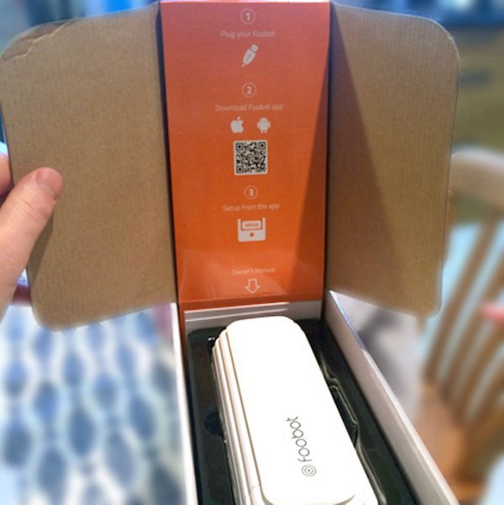
I purchased the Foobot – a self-proclaimed ‘good air guru.’ My family members have allergies and asthma and we thought it could be a good idea to get an air monitor to help us identify what might be causing the occasional allergy flair up. Upon first inspection, the package was beautiful, fun and friendly. The instructions in the box are minimal (plug in, download, set up the app) with a QR code that links directly to the mobile app download. My first impression was that this was going to be a slick experience.
2. Setup
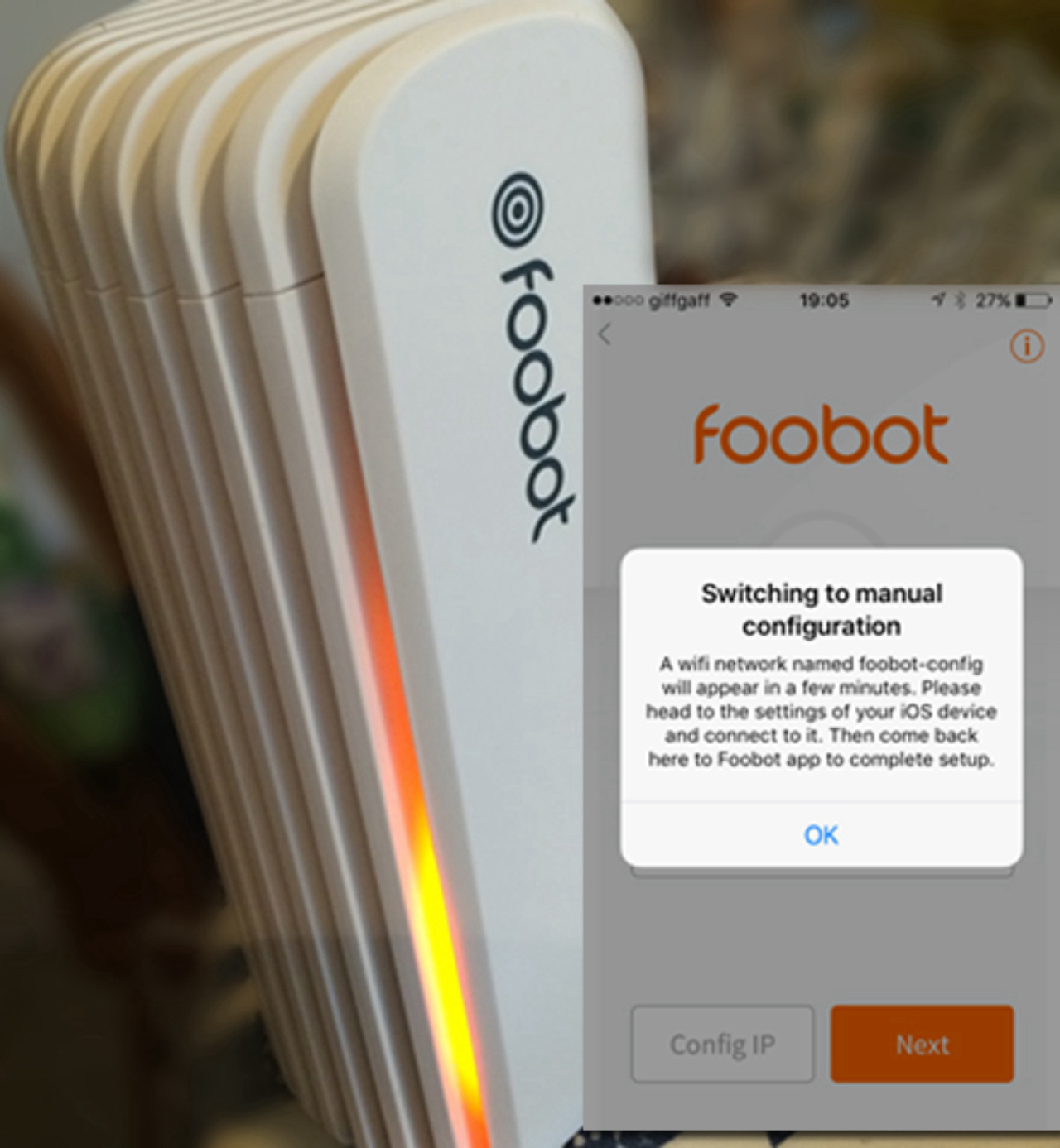
According to the box, the set up seemed like it was going to be easy. After all, there were only three steps and a minimal help pamphlet. However, I did experience a few issues. There ended up being a pretty short distance requirement for the device to the router, which in my house was not possible. This caused a pretty lengthy connection time and some troubleshooting. It did eventually connect, but we still struggle to maintain a constant connection.
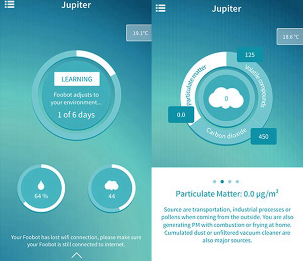
Our second issue was that it didn’t tell us where to place the device (up high, at ground level, near or away from a window, etc.). The only thing it did tell us was that our kitchen is full of high levels of ‘particulate matter’, which was a bit concerning!
When the product promise (from the box) does not align to the actual experience, it does cause user frustration. Luckily, both of the issues I experienced could have been easily uncovered with a quick UX evaluation or user test during the package design phase.
3. Initial use
Once up and running, I found the Foobot interface to be fun to operate. It displays different types of readings with ideal ranges for all: volatile compounds, particulate matter, carbon dioxide, room temperature and humidity. It also provides an overall score on the health of the room. You also get to “name” the device – my daughter called ours Jupiter, for some reason.
I’m not too sure what to do when a room is rated ‘bad’. The Foobot is really great at telling me when readings are high and sending notification to my phone, but I’ve yet to learn what to do if/when I get high readings, despite the box promising us ‘actionable advice’ when this occurs.

Conclusion: remember to think out of the box
My overall impression is that it is certainly a cool gadget to have around the house. I’m having nerdy fun moving it to different rooms to see how readings vary, checking in on the readings while we are away and to see how room air changes over time (when cooking dinner for example).
When organizations involve users in the out of box experience design, they will learn what users expect from the product before they use it, how users anticipate the set-up and how (and where) they will use it once it’s in their hands. This information supports a better, more satisfying design that will leave a positive impression of the product and the brand.
I hope you enjoyed reading about my experience. I would like to hear from you, so please contact me at ben.weedon@gfk.com.
—
Learn more about out-of-the-box experiences.
View our webinar recording, How to think “out of the box” about what your customers are actually buying. In this webinar, Flori Manning, PhD, User Experience Design Director for GfK, highlights what organizations stand to gain from optimizing this memorable experience, user experience best practices and how they are applied to product learnability, and the challenges and considerations for package design and instructions for use (IFU) design.
You can also download our white paper How to design great product instructions: Five challenges to overcome. In this paper, we detail these challenges and how to overcome them.
There are so many ways to connect with your customers with respect to instruction design that yield positive outcomes, including successful product use and how users perceive both product and brand. Read the whitepaper to see what techniques are appropriate for your product’s out-of-box experience.


