This article is re-posted from User Centric’s blog.
Last year saw significant changes in the war between Microsoft’s Bing search engine and Google. Bing struck first when it began powering Yahoo!’s searches, thus accounting for nearly 25% of searches in the United States. Google then unveiled Google Instant, a new feature which predicts search terms before the user has even finished typing. However, even with these changes the search results pages remain much the same as does their requisite effectiveness at gaining and retaining attention.
The Original Study
When Microsoft launched Bing in 2009, User Centric (now GfK’s User Experience team) conducted an eye tracking study to compare the amount and distribution of attention on Bing and Google search results pages.
The most noteworthy difference between the two engines in this initial study was the amount of visual attention attracted by the sponsored links to the right of the organic results: 42% of participants looked at these links on Bing, while only 25% looked on Google. As expected, almost everyone (90% of participants) looked at the sponsored links above the organic search results in both engines. While information on the amount of attention on sponsored results may not be especially interesting to an everyday user, this information is vital to advertisers. Other findings included the relative disuse of Bing’s flyout feature as well as the greater attention received by Bing’s “related searches” over Google’s.
Evening the Playing Field
All participants in the original study were experienced Google users who had never used Bing, as Bing had come out only a couple of days prior to the study. Thus, the uncovered differences in attention between the two search engines could have been due to either interface differences or participants’ unequal familiarity levels with the two engines.
In this research, we revisited the questions posed in the first examination about the amount and distribution of attention on search results pages. However, to obtain a clearer picture of how the engines compared, only experienced users of both Google and Bing were invited to the study.
Method
Twenty-four Internet users between the ages of 18 and 54 participated in the study. Participants conducted an average of 48 online searches per week using both Bing and Google, with at least five searches per engine. Participants’ eye movements were recorded with the Tobii T60 eye tracker integrated in a 17-inch monitor.
During the study, each participant was asked to conduct eight searches: four using Google (without Google Instant) and four using Bing. Prior to each search, participants were provided with a reason for their search (via a scenario) and the exact search term they should enter. The search terms were identical to those used in our original Google vs. Bing study, conducted in July 2009. Two of the searches were informational (“healthy food” and “landscaping”) and two were transactional (“engagement ring” and “last minute vacations”). To minimize order effects, the order of the search terms and the order of the engines were counterbalanced across participants.
Five areas of the search results interface were of interest: (1) sponsored results at the top, (2) sponsored results to the right of the organic search results, (3) organic search results, (4) left pane, and (5) on-hover flyouts (on Bing only).
The eye movement measures analyzed include the percentage of participants who looked at each of the areas of interest (i.e., hit rate) and the time these participants spent looking at these areas (i.e., gaze time). All differences reported in the Findings section are statistically significant at alpha level 0.1.
Findings
Google’s Top Sponsored Results Get More Attention than Bing’s
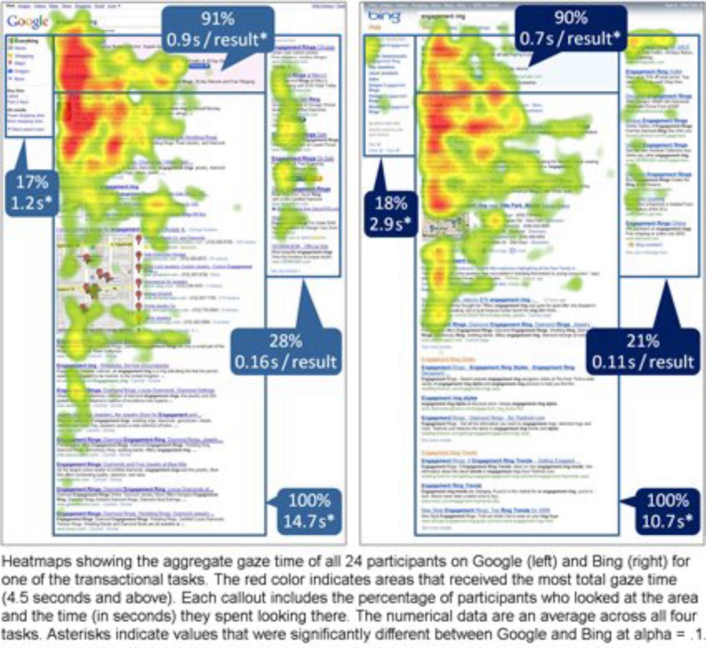
Approximately 90% of participants looked at the sponsored results above the organic results in each search task. This number was comparable between the two engines and did not differ from what was found in the original study. Unlike in the original study, however, participants spent more time looking at the top sponsored results area on Google (2.8 seconds per search task, on average) than on Bing (1.9 seconds). Google’s top sponsored results also received more gaze time per result – 0.9 seconds compared to 0.7 seconds that Bing’s sponsored results received.
More gaze time on Google’s sponsored results was likely due to the fact that, for the search terms used in this study, Google typically produced more information per link than Bing. The top sponsored results on Google tended to have two lines of descriptive text as compared to one on Bing, as well as the Google Checkout button next to some of the links. The additional information may be the reason participants spent more time in the top sponsored results.
No Difference in Attention on Sponsored Results on the Right
As expected, fewer participants looked at the sponsored results on the right side of the page – only 28% of participants looked at these results on Google and 21% on Bing. This numerical difference between the two percentages was not statistically significant.
While the hit rate on Google’s right sponsored results in the previous study (25%) was comparable to the hit rate in this study (28%), Bing’s hit rate was notably higher in the previous study (42% compared to 21%). Because the participants in the original study were unfamiliar with the Bing interface, it is reasonable to assume that “orienting behavior” was responsible for the right side attracting the attention of more participants than in the second study, in which experienced Bing users participated.
The search engines also did not significantly differ in terms of the total time participants spent looking at these results (4.4 seconds on Google and 3.0 seconds on Bing) or the time per result (0.16 seconds on Google and 0.11 seconds on Bing).
Users Spend More Time Viewing Google’s Organic Search Results
In both studies, 100% of participants looked at the organic search results in each search. In the original study, participants spent on average between 7.1 and 7.3 seconds looking at the organic results, and their gaze time did not differ between the two search engines. This finding, however, was not corroborated by the new data. In this study, the average time spent on organic results was much longer on Google (14.7 seconds) than it was on Bing (10.7 seconds). One possible interpretation is that Google search results had lower perceived relevancy and participants were having a more difficult time finding the information they were looking for on Google than on Bing.
Bing’s Left Pane Looked at Longer than Google’s
Since the original study was conducted in 2009, Google has added the left pane to its search results page. According to the findings of this study, the left pane on both Bing and Google was viewed by 17% – 18% of participants during each search, though participants spent more time looking on the left on Bing (2.9 seconds) than on Google (1.2 seconds). This was likely due to the fact that Bing’s left pane contained information more pertinent to the original search term, including a list of related searches, while Google’s left pane featured Google filters (e.g., Images, Videos, and News) and other links that were not relevant to the tasks in the study.

Flyouts on Bing Still Unnoticed and Underutilized
Bing’s on-hover flyouts were found to be similarly ineffective in this follow-up study as they were in the original study. Even though most participants in the original study triggered at least one flyout, almost all of these triggers were accidental (i.e., the participants’ gaze was directed elsewhere at the time the flyout was activated) and only a quarter of participants who were exposed to flyouts ever looked at one.
Flyouts appeared less frequently seen in the second study. Only a quarter of the study participants activated at least one flyout and all of them did it unintentionally. In addition, the activated flyouts failed to attract the attention of any of the participants.
Asked directly about flyouts at the end of the study, only 25% of participants reported ever using them, and 67% said they had never seen one prior to the study. A year and a half after Bing’s launch, two-thirds of participants with considerable experience using it did not even know about Bing’s most unique feature at the time.
Interestingly, Google has recently implemented similar functionality, Instant Preview, but activated with a click. These flyouts may be easier to notice due the color and larger size, but this is an area that will have to be further investigated.
Conclusion
Overall, Bing and Google were comparable in terms of participants’ hit rate on the different areas of the search results interface. Regardless of the search engine, visual attention was mainly focused on the middle column of the page, with all participants looking at the organic search results and almost all at the top sponsored results. The right and left panes attracted considerably less attention. Only about a quarter of the participants looked at the sponsored results to the right, and very few looked at the left pane which contained filters, related searchers, search history and other links.
The differences between the two engines emerged in the time participants spent looking at the different areas. Google’s top sponsored results received more gaze time than Bing’s. Other differences included Google receiving more gaze time on organic results and Bing on the left pane.
Advertising is all about maximizing attention. The results of this study suggest that advertisers should place their ads above the organic search results, where the hit rate was more than three times higher and gaze time more than five times longer than on the sponsored links on the right. When deciding between Bing and Google, advertisers should keep in mind that, ad placement among the top sponsored results on Google attracted 22% more attention than an equivalent placement on Bing.
As Google and Bing evolve, the amount of visual attention on their interfaces will ultimately shift as well.
Aga Bojko is a Vice President, User Experience, at GfK with an extensive background on integrating eye movement analysis into traditional UX research to obtain actionable insights used to improve products and make business decisions. To reach Aga directly, email aga.bojko@gfk.com.


