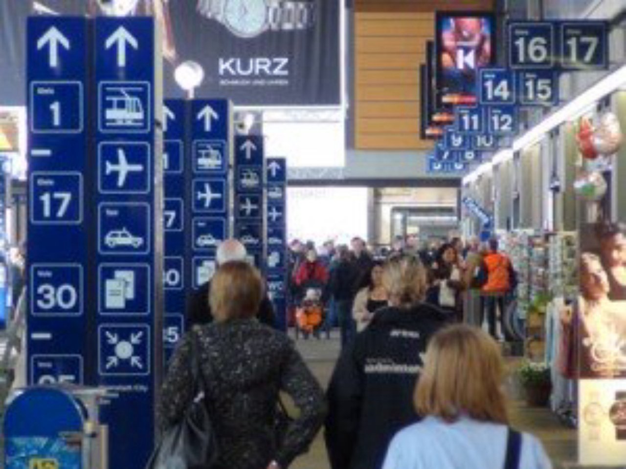
Train stations are complex environments full of information that help travellers get from point A to point B. Because they cannot be simply replaced with a new version, developing a positive user experience in such settings (many of which are over a hundred years old!) can be challenging. One way to make travellers’ lives easier is to improve the station signage, and that’s exactly what we were tasked with by Swiss Federal Railways.
As a part of this effort, we conducted eye tracking research at Basel SBB, one of Europe’s busiest international border stations. Our goals were to better understand how travellers orient themselves, determine usability issues associated with the existing guiding system and evaluate the impact of new pilot measures aimed at improving the identified wayfinding issues.
| We performed the study in two waves, before and after implementation of possible improvement measures. Participants wore eye tracking glasses for each test, which recorded their visual orienting behaviour when looking for a set of predefined locations.Our results from the first wave revealed that travellers don’t rely on signs alone and, to improve wayfinding at train stations, one should take into consideration other factors such as illumination and foot traffic patterns. |  |
A few weaknesses of the current signage system also emerged, including suboptimal placement of several signs as well as inconsistencies between the signs outside of the station and the signs in the building itself.
The second wave measured efficacy and user experience. Since many of the findings from this research apply to other stations, the results also serve as best practices for wayfinding in train stations using user-centered design methods.
Click to read the entire case study
Dr. Pascal Wurtz is a Senior Consultant, User Experience at GfK, specializing in visual perception, eye tracking and eye movement analysis. To contact Pascal, email him at Pascal.Wurtz@gfk.com.


