
The 3 key roles of impactful package design elements
The key elements of impactful packaging design
To assess a package’s design is to look at it holistically and see how its unique elements come together to form a unified product story. This product story tells the shopper — directly and indirectly — what the product is, who it is from, what makes it unique, and why it is for them. But to tell its story, a package needs to disrupt a shopper’s inherent autopilot behavior. Getting noticed is no small task.
The reality is, we ask a lot of a “simple” pack, and its success relies on creating an optimal blend of elements.
Packaging elements are the individual strategic and artistic decisions that go into the final design. They include imagery, logos, text, colors and shapes. Brands can make smarter decisions and ensure the right elements are in place by understanding the critical function they play within a design.
To create a design that maximizes the impact of each element, we must consider their three key roles: power, meaning, and place.
Power
One of the most important yet overlooked roles of a visual element, power refers to the ability of an element to make an impression on consumers. The impression goes beyond likability or the ability to attract attention — it evokes a deeper mental connection. What makes a person spontaneously go into a store? Or choose a new puppy from the litter? There are implicit drivers that are outside of our conscious awareness that affect our behavior and choices.
Why is this important for elements in a package design? A design has limited real estate, and every element that comprises it should be considered a critical part of the product or brand story. If that element doesn’t have inherent power, it can become background noise, giving up its ability to be a meaningful part of the pack’s story.
Our brain has limited resources and uses cues of priority to understand what is most important. Salient elements signal higher importance, so they have more potential to make an impact in the shopper’s brain and thus better contribute to the pack story.
Let’s take an orange as an example of a design element. An image of an orange may be used as a part of a pack story to illustrate a flavor or ingredient. But just choosing any image of an orange risks limiting the design’s potential.
Should the orange be whole? Sliced in half? Sliced in wedges? Shown in a bushel? Which execution has the best opportunity to strike a chord with your consumer and make the most of the element? The answer lies in its inherent power to evoke a deeper mental connection.


Achieving this deeper connection often relies on a unique blend of familiarity (something that a person will automatically identify) and reigned in novelty (something that is uniquely presented but done so in a way that aligns with its utility or general frame of reference). Taking this into account, a perfectly round, uncut orange may not do the trick. While it may be familiar, its lack of uniqueness may put a design at risk of under leveraging a salient design cue.
Meaning
Design elements are used to communicate, often without using words. The design’s story is crafted based on the understood meaning of the elements that comprise it. Because of this important storytelling role, another essential role of an element is to deliver the right meaning to the story.
Going back to the orange example: At minimum, the orange image needs to undeniably cue “orange.” Upon quick examination of the visual, a consumer should be able to identify the element and assign meaning to it. If there’s obscurity in the design story, we risk misinterpretation and derailment of the full takeaway.
Opportunity also exists in delivering meaning beyond the obvious. An orange should be an orange, but what else can it cue about the product through visuals alone? Juicy? Fresh? Natural? Sweet?
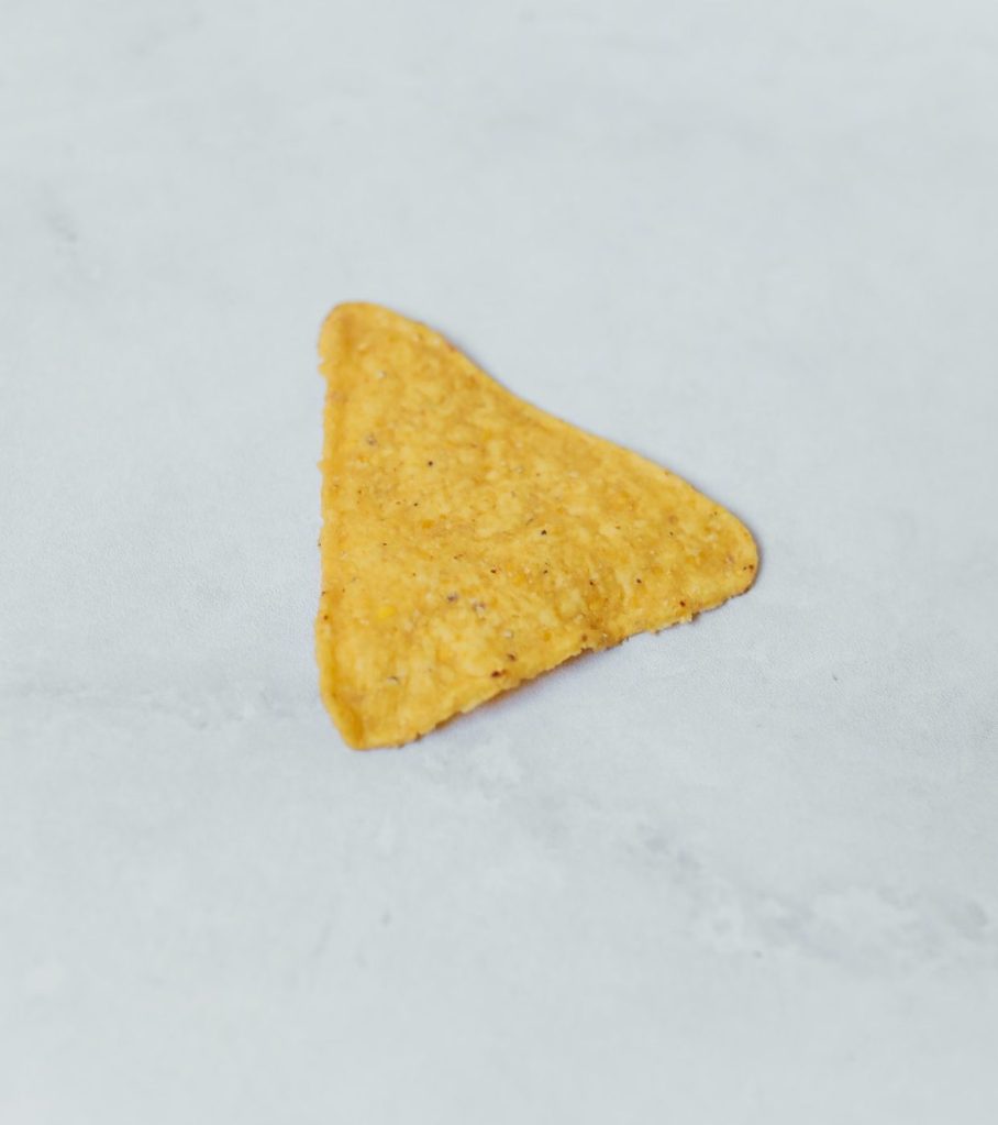
Let’s take look at an application in another popular category, chips. Brands often include chip imagery on the package to give shoppers an idea of what they can expect the product to look like. But is the imagery’s role really that simple? The answer: it shouldn’t be.
An image of a chip can do so much more than representing the product itself — an image can evoke an occasion or the satisfaction of consuming that delicious chip. Knowing that, is showing a single, close-up chip likely to convey as much relevant meaning to shoppers as perhaps a pile or handful of the same product? Not likely. In a category that is driven by craveability and satisfaction, showing these attributes will likely drive more meaning to shoppers.

As humans, we seek to assign meaning to what we see, and leveraging visuals to convey meaning is often more powerful than words themselves.
The takeaway: if you want to convey the freshness of an orange or the satisfaction of a chip, don’t talk about it — show it.
Place
Knowing that the full power of design is realized by the careful integration of its elements, placement within the broader design is the final critical consideration for an impactful element.
NIQ research shows that the mere presence of an element within a design does not guarantee impact. We often see elements that are visually missed (not captured in eye tracking), fail to convey what they need to, or even worse, cause confusion due to poor placement alongside incongruent elements.
To place an element effectively, we must understand the role it needs to play within the design story: omnipresent (setting the tone of the design, like a neutral color to signal something natural or a dog image to bring a category halo) or hierarchical (a communication for a distinct point in the story, like a product or flavor image that is supported by a text-based counterpart). If hierarchical, we must look at the relationship that the elements have with one another.
- Are supporting elements near each other? Think again about the orange visual. Is it visually linked to text-based flavor information, if present?
- Are elements visually weighted appropriately, based on communication priority and power?
- Are we creating visual noise through too many elements? Shoppers are not guaranteed to give every element time to shine, especially if faced with clutter. Just like a written masterpiece, the hardest part of design is editing. But it is the editing that creates the masterpiece.
The many decisions that must be made to select optimal design elements and effectively present them in a compelling design can be overwhelming. But keeping in mind the intention behind each design element and enabling it to reach maximum potential by understanding its power, meaning, and optimal place within a design can be the key to achieving design excellence.

Browse further through our NIQ BASES Resources library
Valuable insights and knowledge, created to elevate your success.