
In today’s omnichannel retail landscape, packaging isn’t just a container—it’s a conversion tool. Especially in gifting, where the pack must win twice: once with the buyer, and again with the recipient.
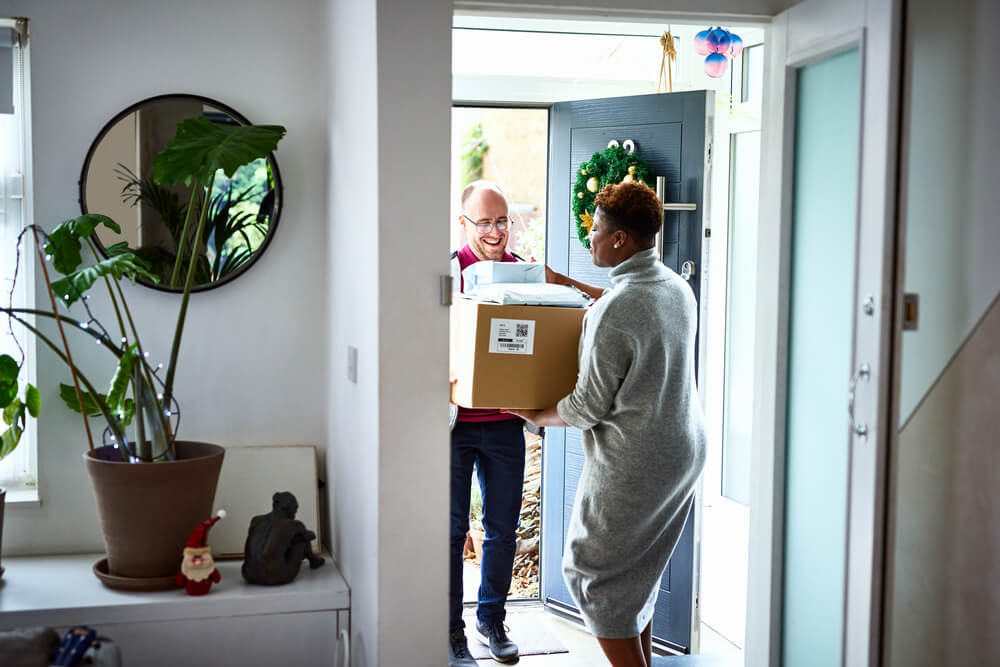
Imagine this: a shopper browsing online spots a golden pyramid-shaped box. It’s eye-catching, feels premium, and looks gift-ready. Click. Add to cart. Days later, the recipient opens it—smooth lid, vibrant interior, and a handwritten note tucked inside. Two moments, one pack, and both parties feel smart, seen, and connected.
This is the power of strategic gift packaging. It taps into human reciprocity, activating trust and emotional connection. But it also navigates two distinct consumer mindsets: the giver, who seeks aesthetic appeal and perceived value (high psychological distance); and the recipient, who values ease, delight, and utility (low psychological distance). Great packs reconcile both perspectives across the journey.

Ready to turn shelf spark into unboxing sparkle for your next gifting brief?
Moment 1: Win the giver at shelf (or online)
#1 Stand out—on purpose.
Gift packs must be visually salient and feel like they’re worth celebrating. Distinctive structures (pyramids, crackers, keepsake tins) create instant intrigue. Confident color stories and expressive illustration signal “special,” not “commodity.” These “intrusive” visuals aren’t noise; they’re engineered anticipation.
#2 Signal premium via fast brain shortcuts.
The brain leans on heuristics when judging quality at speed.
- Superiority: decluttered layouts, balanced whitespace, restrained palettes, tactile finishes that whisper confidence.
- Artistry: curves, crafted imagery, embossing or debossing—rooted in neuroaesthetics, where beauty reads as investment and care, and thus value.
- Scarcity: limited editions, serialized details, precious cues (gold/silver accents used thoughtfully) to nudge FOMO.
- Heritage: dates, hand-drawn marks, symbols that carry history—modernized so it feels timeless, not old-fashioned.
#3 Close with reassurance— authentically.
Givers want proof the gift will land well.
- Pack Windows turn “trust me” into “see for yourself.”
- Seals/certifications reduce risk.
- Authenticity alignment prevents cognitive dissonance: premium cues must fit the category’s mental codes. (Example: in wine, aged textures and heavyweight paper read as authentic quality; overly shiny, new car chrome can backfire.)
#4 Make it instantly gift-worthy.
Bows, ribbons, message cards, prewrapped structures: these eliminate effort and accelerate choice. Occasion cueing further reduces cognitive load—holiday, Diwali, Eid, Lunar New Year—while timeless elegance ensures a long tail. The best portfolios layer seasonal excitement over a durable, cross-occasion core.
#5 Let sustainability make everyone look good.
Eco signals on pack aren’t “nice to have”; they can elevate the giver’s self-image—especially in public shopping contexts where “conspicuous conservation” is noticed. Consider rightsizing or removing secondary boxes when the primary pack can carry premium cues without waste. State the claim clearly and credibly.
Moment 2: Delight the recipient at unboxing (and beyond)
Discover how NIQ can support your next gifting packaging strategy
#1 Design the reveal like a miniature theater.
Layered surprises deliver microbursts of reward; a calm exterior with a vivid interior creates surprise contrast that boosts attention and memory. Texture matters: rigid boards, soft touch, foil hits, and subtle grain create a tactile ritual—a sensory signature the brain encodes as care and indulgence.
#2 Make ease the hero.
The easier the mechanics (magnetic closures, smooth slides, intuitive grips), the more cognitive resources remain for positive emotion. Recipients often weigh convenience and utility more than pure looks. Beautiful is good; beautiful and effortless is unforgettable.
#3 Protect the product—protect the joy.
Breakage doesn’t just disappoint; it triggers a reward prediction error and loss aversion—losses loom larger than gains. Sturdy, compact structures that travel well safeguard delight at the precise moment emotion is peaking.
#4 Make it personal—and lasting.
A space for a handwritten note signals genuine thoughtfulness. Materiality—velvet touch, smooth finishes—does more than impress; it transfers care. And when a pack is reusable (a keepsake box, a chic tin), it stays in the recipient’s world longer, quietly building familiarity and preference through repeated exposure and a sense of ownership.
When you blend design craft with brain science and real-world behavior, you don’t just make a prettier pack. You reduce decision risk, increase conversion, and turn unboxing into a brand memory the recipient wants to repeat—and the giver wants to recreate.