This article is re-posted from User Centric’s blog.
The stylish and iconic Mini brand has experienced a revival in recent years that has brought two entrants to the US market, the Mini Cooper and the Mini Clubman. Thoughtful engineering and design have made Minis ‘zippy’ and fun to drive, roomier than expected and, let’s face it, cool. Take the Mini Clubman for example. Compared to its cousin the Mini Cooper, it is approximately 10 inches longer, which affords more leg room for rear seat passengers and greater trunk space while not compromising on performance.
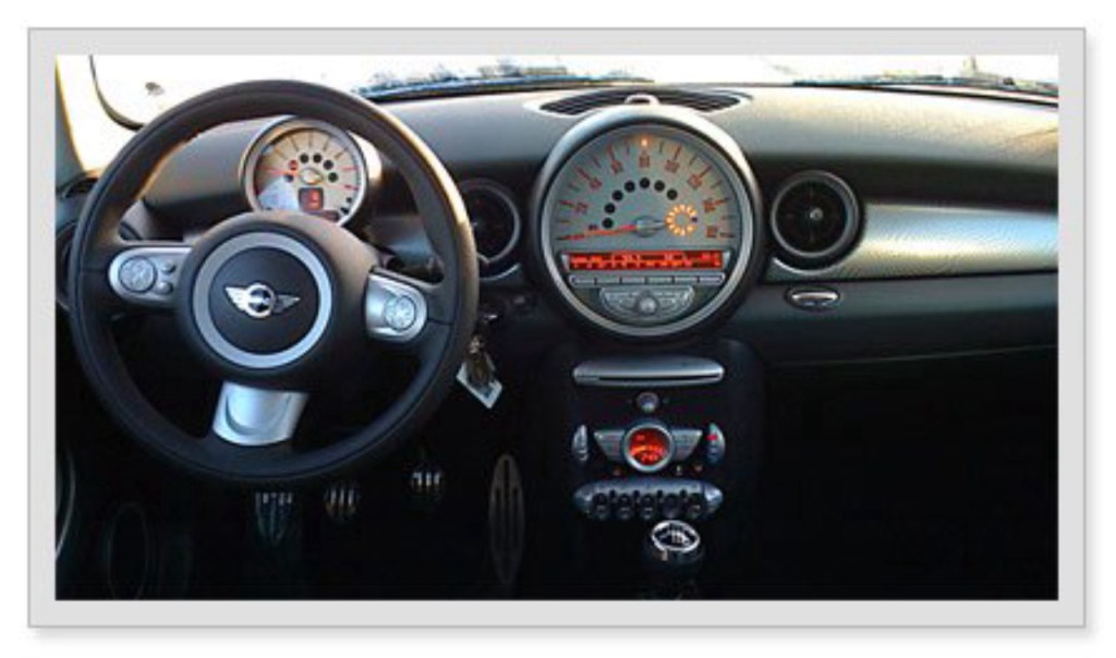
Unfortunately, this same thoughtfulness does not carry over to the user interface (UI) of the car dashboard (Figure 1). The dashboard suffers from awkward relationships between buttons and the display, inefficient layout of controls, poor error recovery and some labeling issues. In short, while Minis may be fun to drive, the dashboard UI diminishes the overall user experience of the car. This review is based on our extensive experience with in-vehicle systems and UI best practices.

Figure 1: The Mini Dashboard, while possessing a “cool factor,” provides a questionable user experience.
Center Console: Buttons That Don’t Relate
The dashboard is dominated by an oversized analog speedometer in the center console, which also contains the car’s FM tuner and other audio controls. As the center console is a frequent area of interaction for drivers, it is important for the UI to be intuitive.
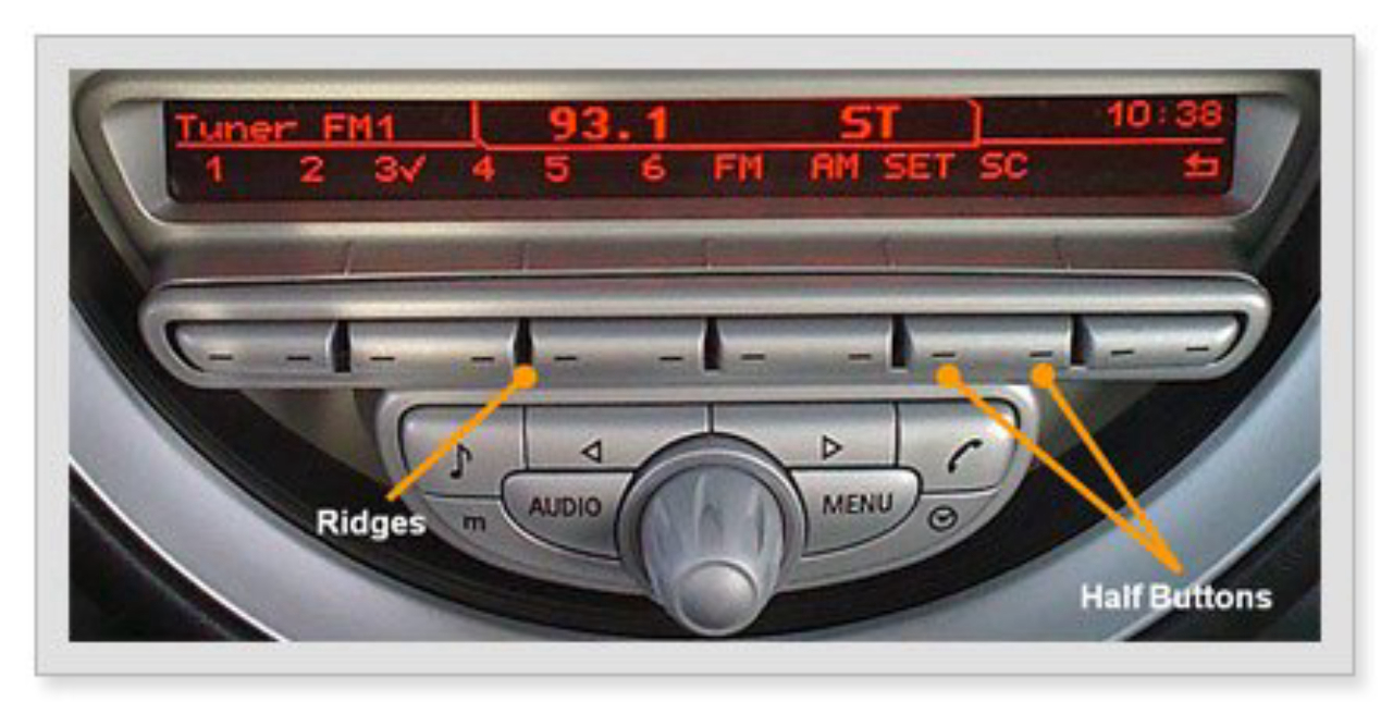
While the large speedometer is easy to read, some controls on the center console create an uncertain user experience. Some of the most commonly used buttons are below the FM tuner display, but they are presented in an unusual way. For example, as seen in Figure 2, each button below the FM tuner is marked with two lines that essentially divide it into two “halves,” doubling the total number of buttons available. Dividing the buttons in half makes the target area smaller and more difficult to accurately hit, increasing the chance of errors.
Moreover, the “half” buttons, on either side of the ridges, are spaced so closely together that it may be difficult to hit the correct half-button when viewed from the angle of the driver’s seat.
Mapping is the relationship between controls or buttons and and their intended actions or results (i.e., what they are controlling). When looking at the display from the angle of the driver or front passenger, these buttons correspond or ‘map’ awkwardly with the associated functions on the display screen (see Figure 2). Additionally, the two markings on each button do not provide two precise and distinct target areas and there is no boundary line or tactile indication on the buttons themselves to help guide drivers to the proper half of the button. In other menus, the mapping becomes even more confusing as some functions map to the entire “single” button and others to the “half” buttons. These issues are aggravated at higher speeds since drivers have less time to devote their attention to interacting with the display.

Figure 2: The spacing and division of the half buttons on the Center Console results in awkward “mapping” of these buttons to their associated functions on the screen.
Audio System: Layout of Controls and Error Recovery
The Clubman has a very powerful and feature-rich audio system with clearly labeled controls. Most of the controls for the audio system and the car’s computerized settings are situated near the speedometer. The two buttons labeled ‘Audio’ (to switch modes) and ‘Main Menu’ on either side of the selection button work as expected and allow for easy navigation. The labels on most other buttons are easily understood, including one with an eighth note icon for controlling audio levels (bass, treble, etc.) and another with a phone icon for Bluetooth pairing and use.
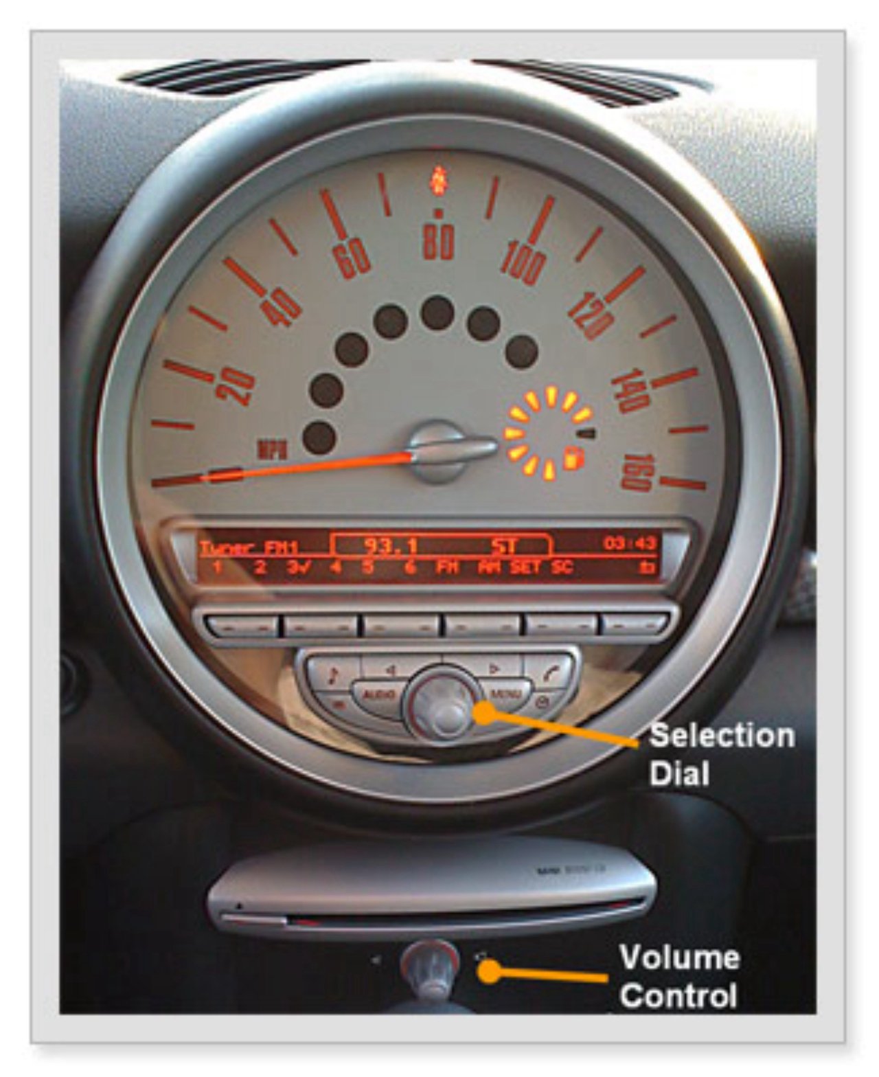
However, the audio system suffers from an inefficient layout of controls and poor error recovery. The selection dial could be mistaken for the volume control (Figure 3), which actually sits further down below the CD player outside of the main area of interaction. This control is seems disconnected from the rest of the audio system.
The system has direct iPod and iPhone connectivity, providing users versatility and flexibility with inputs for both auxiliary and USB cables that can double as device chargers. However, when we used the iPhone in both AUX and USB mode, a message read “this accessory [cable] is not made to work with the iPhone.” The Mini’s user manual says that the cable is only made to work with some iPhone models, but it does not say which ones it works with and, more importantly, it does not say how to find out which models it does work with. It is important for users to be able to recover from errors and build trust in the systems that they use.
On the audio system’s display, it is not clear whether the default list view is by song or album when connected to an MP3 player. Although many users are familiar with their own music library, others might have more difficulty recognizing the files on the display. One positive for the audio system’s display is that drivers are able to navigate through lists using either the main selection dial or the center console buttons.

Figure 3: When operating the Mini Audio system, the Selection Dial could be mistaken for the Volume Control based on its positioning.
Tachometer: Labeling of Controls
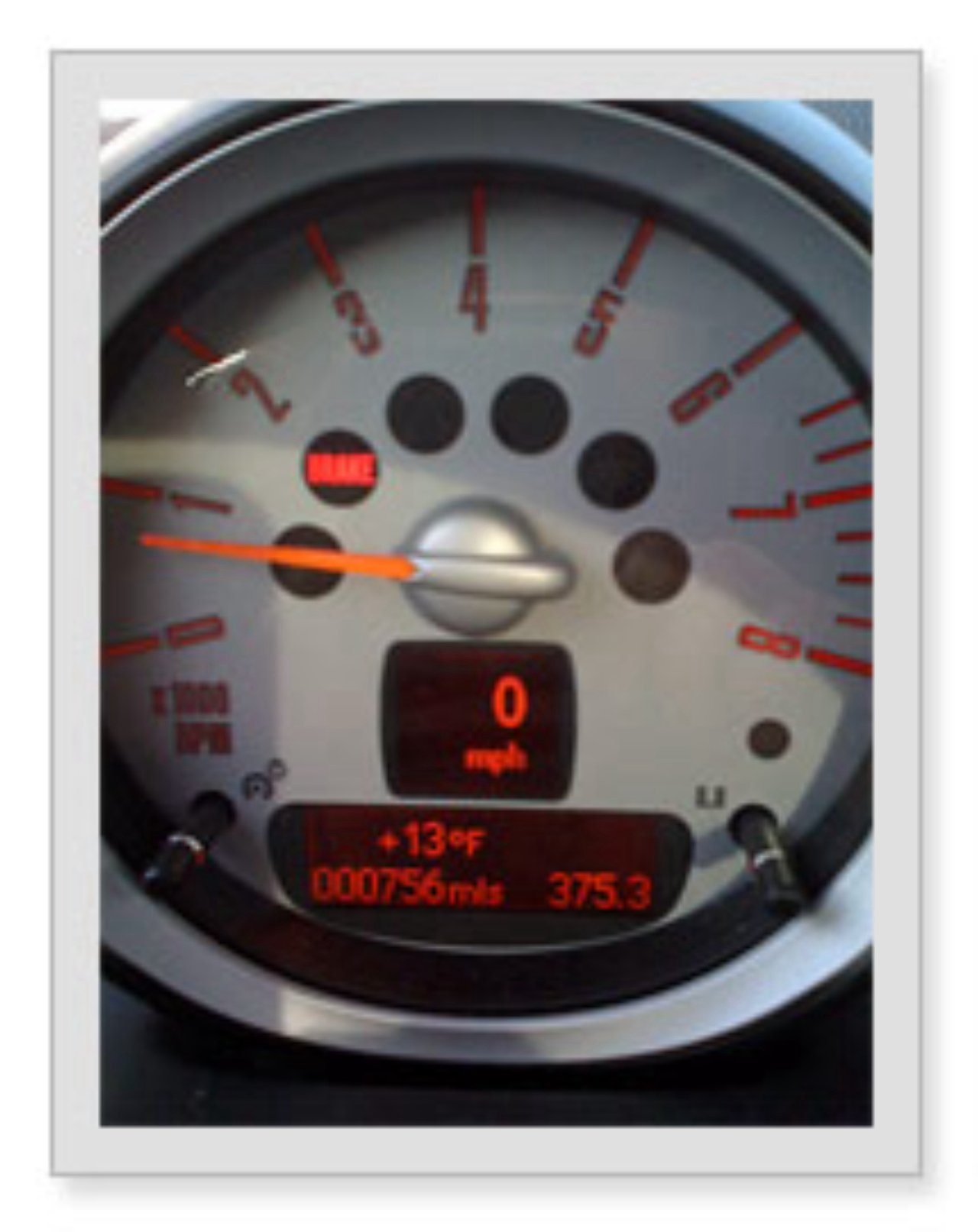
The Mini Clubman features a tachometer that sits above the steering column. In addition to showing RPM and total mileage, the tachometer (Figure 4) consists of two displays that can be customized to show pertinent information such as outside temperature, time, trip mileage and the particularly useful feature that shows the estimated mileage until the car’s fuel tank is empty. The driver can also choose to display the speed digitally in this area, which brings the information closer to the driver’s line of sight.


Figure 4: The Tachometer display can be customized. Figure 5: The Tachometer Control, on the left steering column arm is not clearly labeled.
Despite the benefits of the feature, the control (Figure 5) that toggles the tachometer’s display between options is obscurely placed at the end of the left steering column arm, and is somewhat cryptically labeled ‘BC.’ Users will benefit from self-evidency and clear labeling of system controls when learning how to use new features of a car dashboard. Additionally, system controls should be placed in close proximity to their related displays.
There is no doubt that the meticulous engineering of the Mini has led to an engaging driving experience. However, the user experience of the dashboard UI does not quite provide the driver with the same satisfaction. In the end, the Mini Clubman’s dashboard UI needs to be simpler to use, especially at 125 mph.
Read about our Automotive UX Research and Design solutions.


