The role of eye-tracking
Previously, BASES explained why it is important to evaluate both the conscious and non-conscious elements of the shopper journey. Exploring these avenues gives brands critical information to determine the design’s full potential.
Eye tracking is one, but not the only, tool to understand non-rational reactions to product packs. Eye tracking exercises are often used to understand shoppers’ non-conscious takeaways of pack designs by highlighting what elements they focused on visually. This information can be used to make recommendations about pack layout, the size of elements, and more. The optimizations identified by pack eye tracking can be powerful.
However, when the packs are analyzed at a superficial level, key insights can be missed. By layering in other non-conscious measures, such as analysis by neuroscientists, brands can evolve their understanding of shoppers’ perceptions.
There is a fine line between the seen and unseen
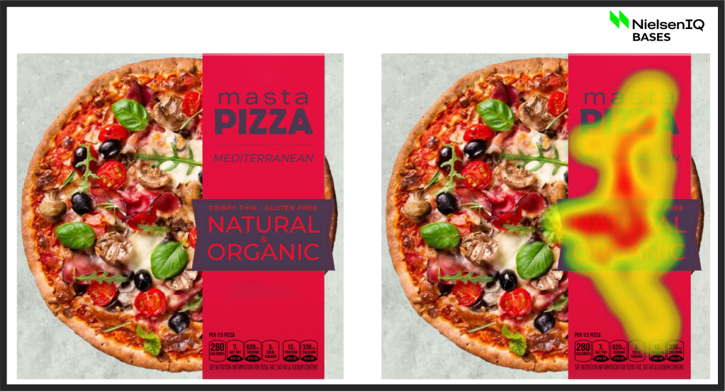
Looking at the pack example below, we can see that the pizza image shows no “eye tracking heat.” This measure alone would suggest that the food imagery was not engaging, and that all of the consumers’ focus was on the text—and that to optimize the package, the brand should improve the imagery and reduce the prominence of the text.

Does this really mean that the pizza image is unseen and needs an update?
Further analysis by a neuroscientist would suggest otherwise. Our eyes are drawn to words—reading is automatic, and therefore text elements of a pack have the highest amount of heat by default. This doesn’t mean that the image is unseen—it is seen from the corner of the eye but does not need any further attention for it to be understood, hence it gathers less heat.
Based on this knowledge, the guidance would depend on the goals (focus on brand, flavor, etc.) and the image may not need any rework.
Faces on packs always capture attention, for better or worse
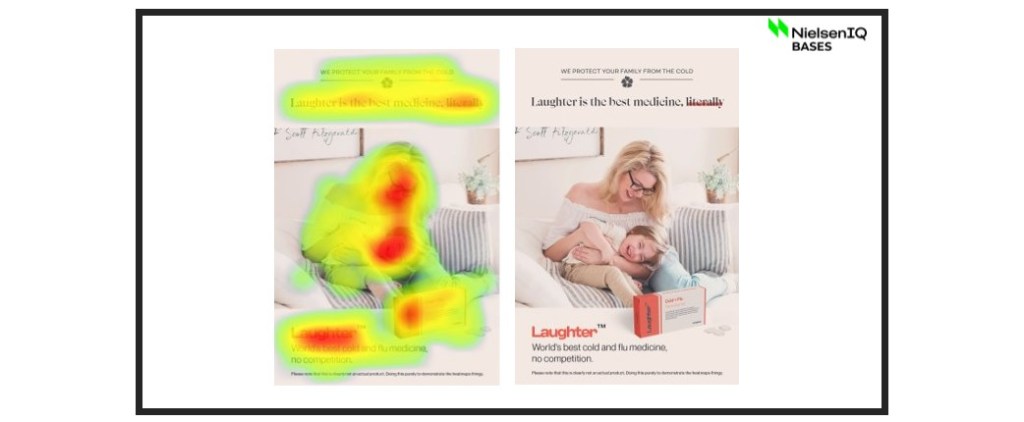
We know faces on packaging capture attention, and often see a lot of heat on faces in eye-tracking exercises. You may be tempted to conclude that including a face on the pack is a good thing. But not always.
In the example below (image on the left), the face in the lower left hand corner of the pack captured attention, but we found that overall it was much less engaging—the face was a distraction. The alternative pack that was tested on the right, without the face, scored better on emotional engagement. So, what catches people’s attention on packages is not necessarily positive.

Looking at these examples and what we now know, faces can positively and negatively impact your design depending on your goals. It is important to consult with a neuro expert to determine the right approach.
Brand visibility and brand resonance are not always correlated
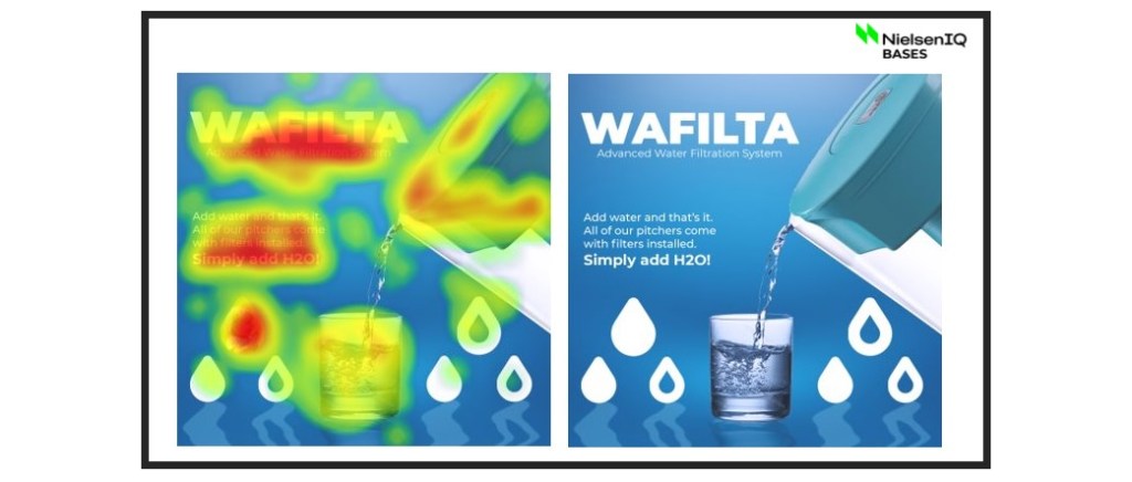
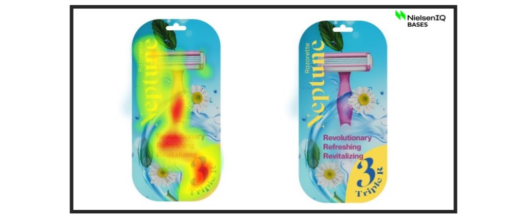
In the example below, the image on the left has a lot of eye tracking heat on the product name. Does this mean this product has high brand recognition? BASES research found that this was not the case. While consumers looked at the brand name, this pack did not score well for brand resonance.


On the other hand, the razor imagery pack above saw less eye tracking heat on the product name, but scored well on brand resonance, triggering the right associations with consumers. This illustrates how eye tracking alone doesn’t fully answer pack performance questions—it is most valuable when combined with neurological insights that can help brands interpret the results.
When doing pack or ad research, the goal is to understand what consumers deem important, and why they deem it important to their decision-making process.
When doing research with NielsenIQ BASES, brands are provided with insights like the examples above by utilizing our team of design research experts and Neuroscientist PhDs to help present further analysis. Taking the necessary step and breaking away from surface level analysis is vital to success.


